As a contemporary artist I like to start with what I know and then explore materials and see where the quest leads. It is the same process I use as a teacher and it usually results in work that has responded to change, chance, connecting and thinking .
I aim in the next few weeks, to create participatory work that is a collaboration with Paula Dimarco, Physiotherapist.
I am firstly investigating Physiotherapy in conjunction with the dynamic Physiotherapist Paula Dimarco. I know very little about her job at present, and although I have had physio for a foot injury and a frozen shoulder, I remember little about the treatment other than the arduous nature of movement during the early days of the body’s healing process.

I am drawing with my broken and now mended foot, exploring how the unfamiliarity of familiar materials makes new marks.
We have chosen to work in blue as Physiotherapists wear blue.

We have established the Rubik’s cube as a start concept as it is familiar, a puzzle that changes with intervention and is different every time someone uses the cube. It very much echoes the systems and bespoke opportunities of the Therapies Service.
Paula has given me a case study to work from and I am trying to piece together how a patient’s complex needs are met by the Therapy Services.
I am inspired by Artist Fiona Rae’s paintings, she combines gesture and playfulness. she always starts her paintings by looking at the paint that has dried on her palette from previous paintings, she works with what is left in order to create a new image that embraces and responds to change.

I decided to play with this idea, exploring what I know about each service using simple materials, myself and all the colours as dictated by the Rubik’s cube, and Alison and Paula.

I played with yellow, pushing a very healthy pear around my paper with a yellow pencil. we chose yellow for Diet and Nutrition services.
The marks were dictated by the yellow pear wobbling around the page in response to my pencil moving. This seemed to be very much in line with what natural food is; fresh, soft and unique.

I played with green, looking at plugs and connectors that I use every day at home and at work. I moved these familiar objects around and allowed my green pencil to respond to the marks , shadows and twisting cable.
We allocated the colour green to Occupational Therapy.


I next explored orange, the colour we allocated to Psychology. the orange was very enclosed in its skin but once peeled it revealed a very interesting surface beneath. It was a struggle to get the peel off but it was a rewarding experience.

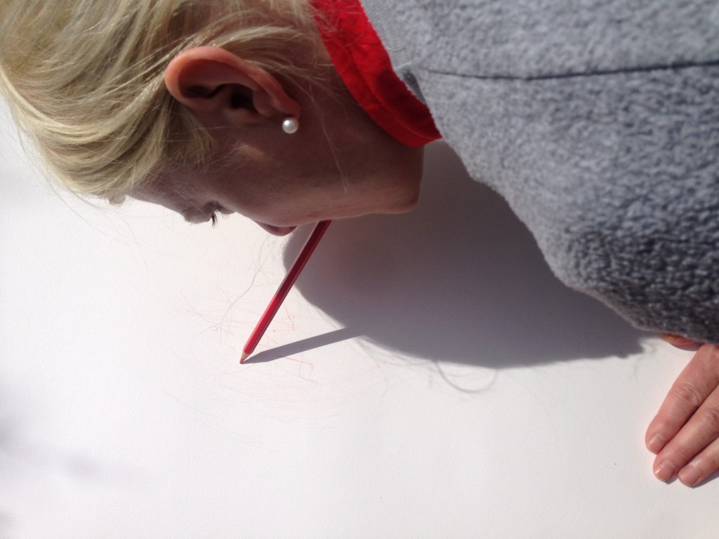
We allocated Red to SALT, Speech and Language; here I am trying to speak and draw at the same time! the resulting chaos of marks are surprisingly delicate as I try to negotiate my words and move the pen in order to communicate visually.
The last colour, white, is Podiatry and I know little about this. I need some more information.
I am returning to Paula to find out more.
I intend to print out the original drawings and use them as a basis for illustrating a case study from each service.

Can you see this drawing differently now?
At the Therapy Services Conference I would like to try these activities with the delegates in order to build up a resonant picture for the delegates of the complex bespoke service that the Therapy Services provide for patients.


Leave a comment